part 1: foundations
accelerating anaconda with an ai-connected design system
overview
Role
Lead Product Designer for
Foundation and Pattern Design
product
Shared foundation for Anaconda’s product portfolio
collaborators
Product manager, 3 designers, and 2 engineers
timeline
3 months
constraints
Acquisition-related uncertainty, competing stakeholder priorities, and framework limitations
impact at a glance
3 product teams
adopted the system as the foundation for an org-wide rollout
weeks → days
design-to-engineering handoff time
2–4 weeks
from idea to handoff with the AI-assisted workflow, down from 1–3 months
the problem
Anaconda’s designers and developers need a way to prototype, build, and ship consistent screens faster, because disconnected design libraries and code require manual alignment and repeated work, which slows handoffs and delays delivery.
Business Need
Anaconda needed to ship products faster while reducing design and development costs. A shared, AI-connected design system would cut repeated work, speed up handoffs, and help teams deliver more with existing resources.
Design and Engineering Need
Designers and developers needed shared, reliable building blocks to quickly prototype ideas, hand off designs, and build screens without recreating components or resolving inconsistencies between Figma and code.
foundation
Choosing a foundation built for speed
We compared leading component libraries to find a foundation that could support our new stack, work with AI tools, and help designers and developers move faster together.
our criteria
What we needed from our foundation
Guided by our Architecture Decision Record, we evaluated each library against five requirements:
Svelte Support
Compatibility with Ai-assisted design and code generation
Code ownership and extensibility
Accessibility
Flexible theming


our recommendation
Why we recommended shadcn-svelte
Built for our Svelte stack
Aligned with our chosen framework and gave design and development a shared starting point.
a lightweight foundation
Provided the flexibility to build around the components we needed.
Code that our team and ai could work with
Components lived in our repository, giving developers control and AI tools access to the code they needed to build on.
accessibility we could inspect and improve
Access to component source code made it easier to evaluate accessibility and address issues directly.
system structure
turning a component library into a shared system
I organized the Figma library, prioritized delivery, and defined when components were ready for engineering, giving the team a clear path from foundations to reusable patterns.
METHODOLOGY
Creating structure with atomic design
shadcn gave us the building blocks. I used atomic design to organize them into foundations, components, and patterns—defining how they fit together to create consistent screens.


library structure
Making the system easy to navigate and deliver
I organized the library and delivery process so designers could find what they needed and engineers knew what was ready to build.
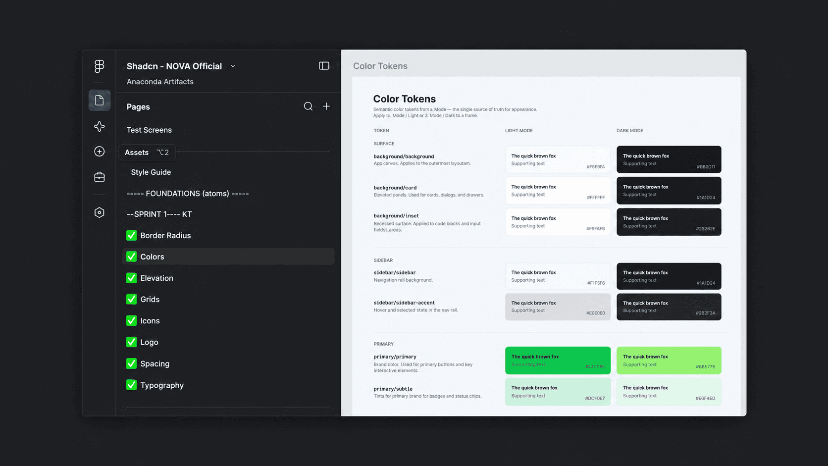
ORGANIZING FIGMA
applying atomic design
I separated foundational elements, components, and patterns into clear groups so designers could find, reuse, and understand how they fit

Planning delivery
building in the right order
I planned foundations and variables for Sprint 1, then dependent components for Sprints 2 and 3, tracking delivery in Jira.
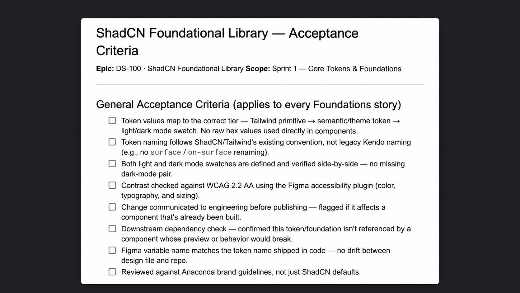
defining readiness
Setting a shared standard
I added acceptance criteria to each component’s Jira story, giving designers a checklist to complete before handoff and engineers a clear standard for what was ready to build.
component design
making the library our own
I applied Anaconda’s visual foundations to the prebuilt components, then we checked token mappings and layout rules and reviewed accessibility across light and dark modes.
the atoms
applying Anaconda’s visual foundations
I customized colors, typography, spacing, border radii, elevation, icons, and logos to establish a shared visual foundation.


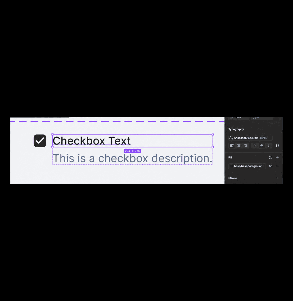
the foundations
checking every component against the rules
We reviewed component sizing, spacing, and styling, checking that color and typography tokens were mapped correctly throughout the library.
the review
Improving accessibility and trimming what we didn’t need
We reviewed components across light and dark modes, corrected contrast issues, and removed unused components to keep the library focused and easier to maintain.
Testing revealed insufficient text contrast in dark mode. We adjusted the muted-foreground token to improve readability.
constraints & tradeoffs
Adapting our approach to keep design and code aligned
Our existing component structures and token conventions didn’t always fit the new library. I adjusted both to keep Figma aligned with implementation.
constraint 1
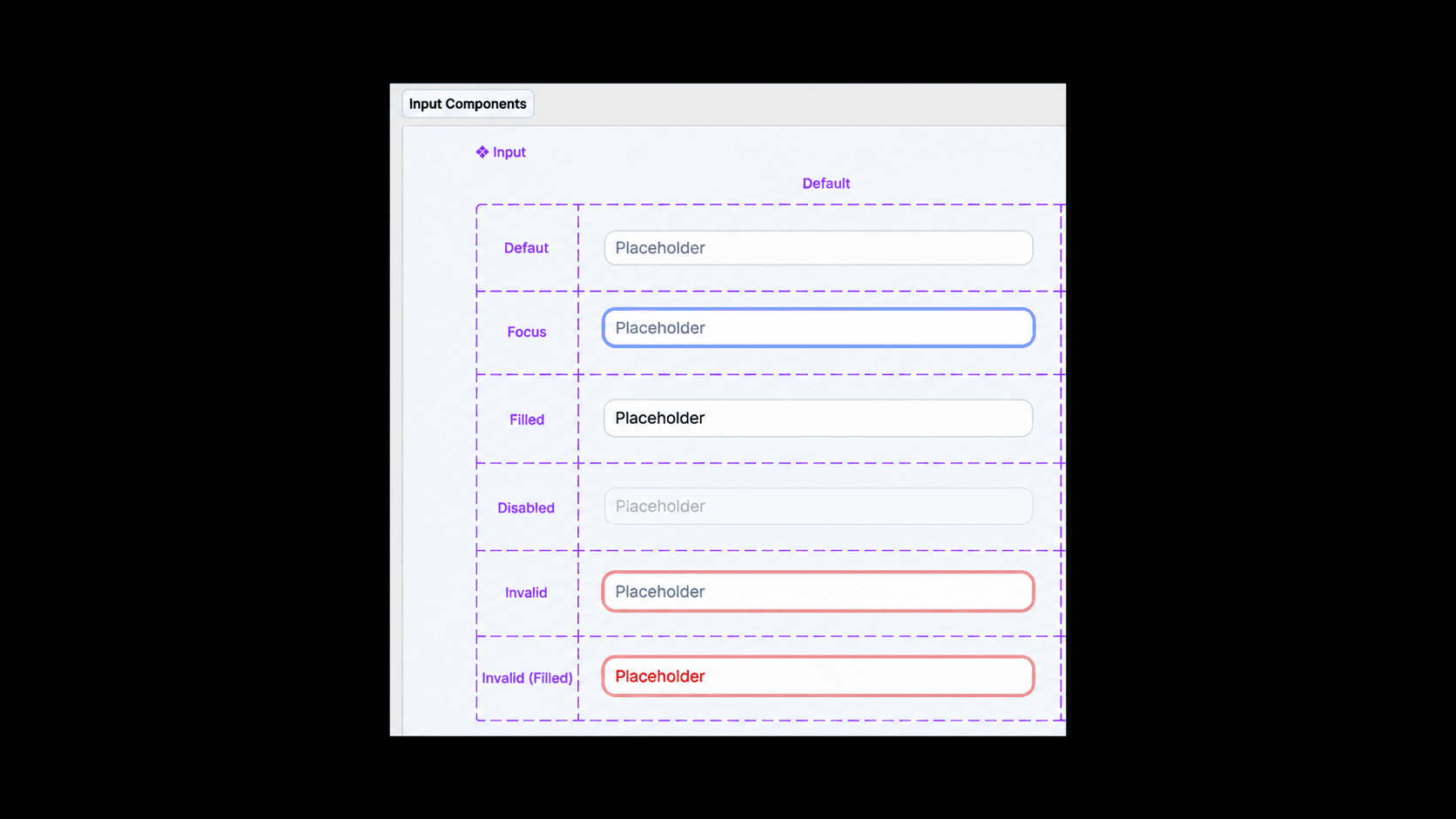
Restructuring components to match code
Inputs were initially grouped under a single parent component with Boolean properties. When that structure didn’t match implementation, I returned them to shadcn’s Figma structure so design and development followed the same model.
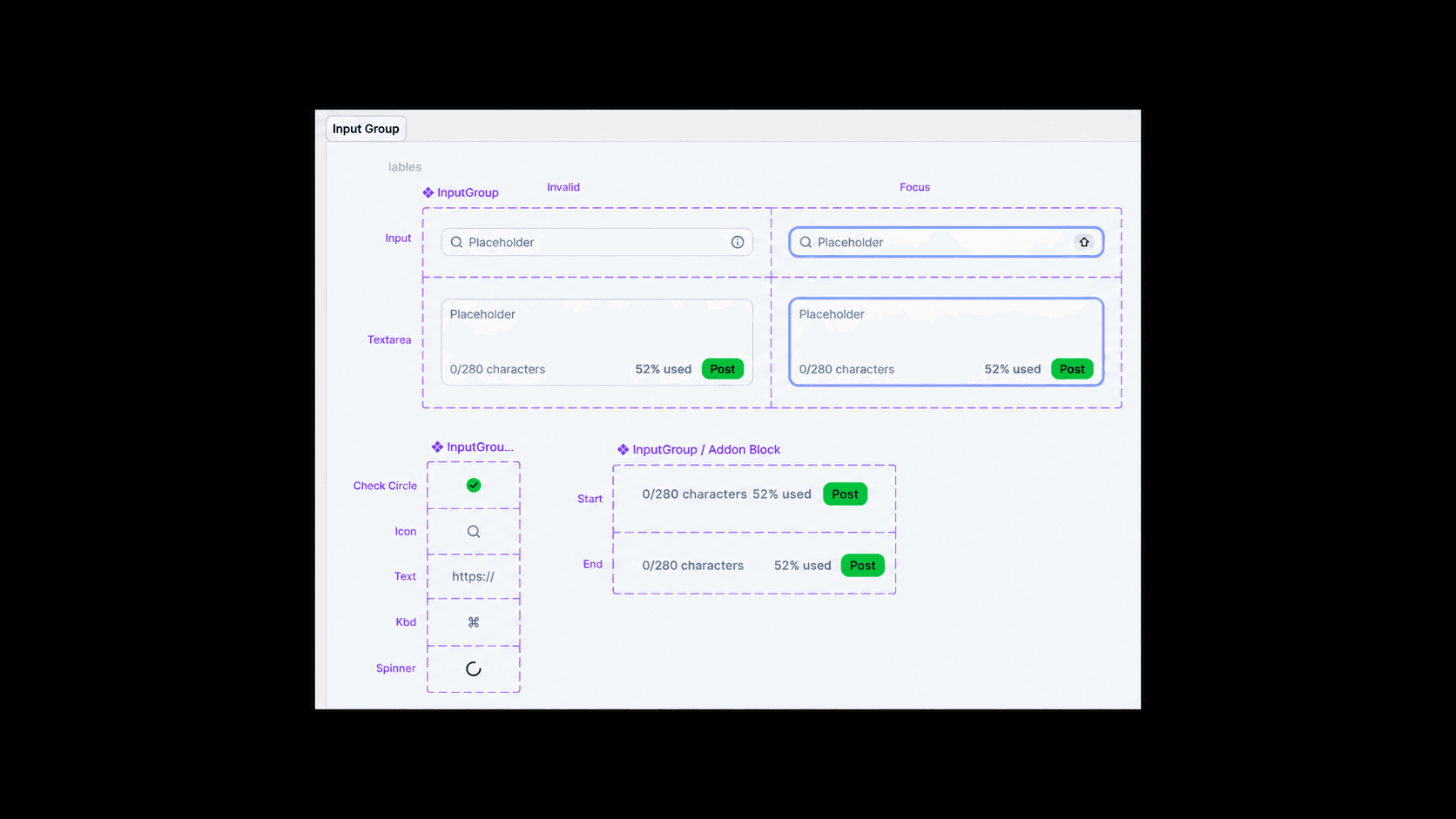
constraint 2
Rethinking token names to protect the connection
Token naming conventions carried over from our Kendo library caused implementation issues. I restored the expected names, remapped affected components, and checked color and typography mappings across light and dark modes.
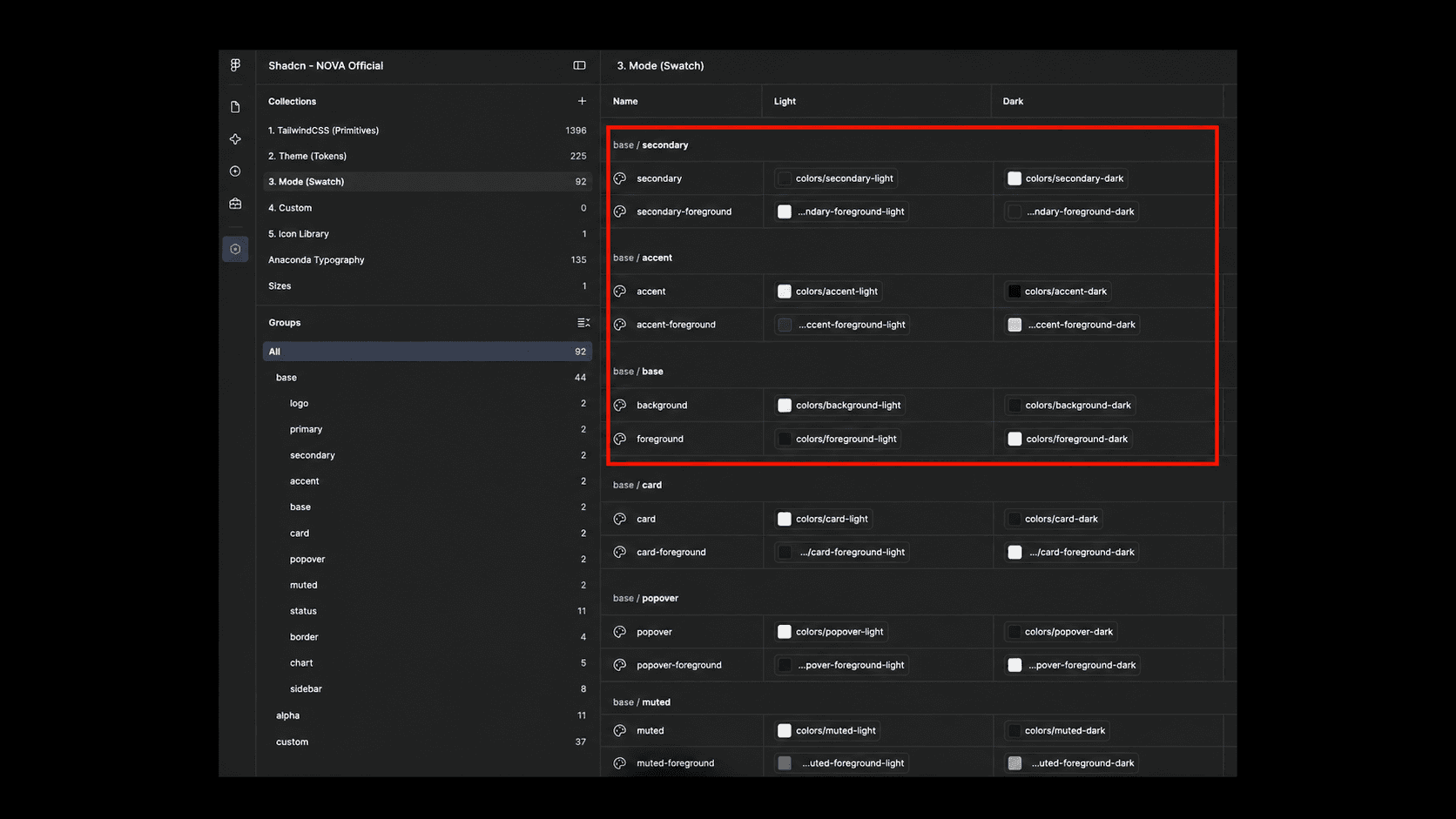
The token names required to keep the new library aligned with code.

The naming conventions carried over from Kendo that caused implementation issues.
constraint 3
finding common ground across teams
Acquisitions brought together teams with different product identities and expectations. We worked through decisions about color and component styling, clarifying what belonged in the shared library and what needed broader brand input.
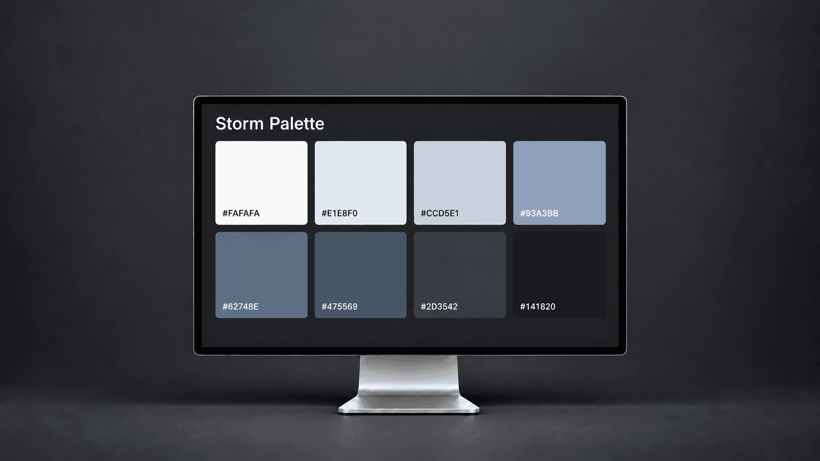
Different views on the Storm palette highlighted the need to involve new stakeholders in color token decisions.

Teams had different preferences for focus states. We adjusted the effect while retaining shadcn’s default border.
testing
Putting the system to work with AI
I led tests of whether Claude could turn our Figma library into consistent patterns and screens. Each iteration showed where the system worked and where it needed clearer guidance, shaping the pattern library that came next.
Checking consistency by building two screens by hand
We assembled screens in Figma to check how components worked together before testing AI-generated layouts.
Comparing Claude Design and Claude Code
I tested both tools to see how quickly they generated usable screens, how closely they followed our design system, and how well they organized layouts.
Claude design
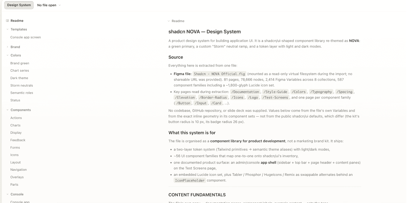
Imported our foundations into Claude Design from the Figma file.

I asked Claude Design to recreate one of our desktop prototype screens from a screenshot.

The output stayed in prototype format: great for quick concepts to show stakeholders and clients, but not usable for developer handoff.

CLAUDE Code

Connected Claude Code to our foundations library through a Figma link.


I gave Claude Code the same prototype screenshot and asked it to build the screen in Figma.

The Figma output was excellent. Not every component was linked, and the gaps showed us exactly where we needed patterns.
outcome
A shared system teams actually adopted
The foundations became the shared starting point for Anaconda’s product teams, and the base for the pattern library that followed.
before
Figma libraries and code built separately
Every screen aligned by hand
Handoffs took weeks
AI tools had nothing reliable to build from
after
One shared system in Figma and code
Tokens mapped to code, components ready to build
Handoff in days, adopted by 3 product teams
Claude Code builds on-system screens from the library
reflections
Building a better system meant rethinking how we worked
Leading this system end to end changed how I approach ownership, from shaping the workflow to keeping delivery on track.
1
learn the rules before rewriting them
I learned to understand the system’s structure and check with developers before changing it. What felt simpler in Figma created extra work in code.
2
Invite input, clarify ownership
Midway through, we narrowed ownership to two designers, with the wider team providing feedback. That worked better. Next time, I’d establish owners and review criteria from the start, then stick to them.
3
keep testing as we build
Testing real screens with Claude revealed gaps that individual component reviews missed. Next time, I’d bring those tests in earlier to refine the foundations and patterns as we built them.