removing download friction to increase conversions
overview
Anaconda’s registration-first flow created friction between marketing’s email goals and product’s download goals. I aligned both teams around a download-first experience, moving the signup invitation afterward so users could get the product while marketing retained an opportunity to connect.
Role
Lead UX Designer
product
Cloud
collaborators
Product manager, engineer manager, 2 senior engineers, and 1 user research
timeline
Q2-Q3
constraints
Late design involvement, competing team priorities, and resistance to changing the registration flow.
early impact based on a/b testing over 4 weeks
+15% download conversion
Helped more visitors download the product by removing registration from their path.
−20% invalid email rate
Reduce the share of fake or incorrect emails by making signup a voluntary choice.
+5% download-to-Cloud signup
Encourage downloaders to create a Cloud account through a relevant invitation on the thank-you page.
the problem
Users trying to download Anaconda needed a clear path to the product, because the current flow made an optional e-mail signup required, causing users to abandon the download.
Business Need
Increase product downloads and adoption while acquiring email subscribers to help marketing nurture potential customers.
User Need
Download Anaconda quickly and easily, with a clear choice about whether to share an email address.
constraints & tradeoff
Building alignment after the changes were already live
I entered the project after marketing had changed the download flow without design input. Improving the experience meant revisiting those decisions and earning support for a different approach.

constraint 1
Working backward from a live decision
The registration step was already in place. I had to investigate its impact and build a case for revising the flow while users were experiencing the friction.

constraint 2
Challenging an established position
Marketing strongly favored keeping registration first with the existing skip link. I had to actively bring design into the conversation, using research and A/B testing to make the alternative worth reconsidering.
the dilemma
An E-mail signup became a barrier to downloading
What began as a way to collect emails created a barrier to the product. Making registration optional afterward failed to resolve the friction.
part 1: the original
A direct download, but no email capture
Originally, users could click “Download now” and get the product. Marketing wanted a way to collect email addresses and nurture potential customers.


part 2: marketing's unilateral redesign
Registration became a requirement
Marketing added a mandatory email step without first aligning with product or design. Downloads dropped sharply. Additionally, some users entered fake email addresses just to get through, undermining the value of the contacts collected.
As a designer, I had to solve for this question:
research & validation
building the case for a better download experience
I brought together usability findings, user behavior, and signup data to show stakeholders where registration created friction and why the flow needed to change.
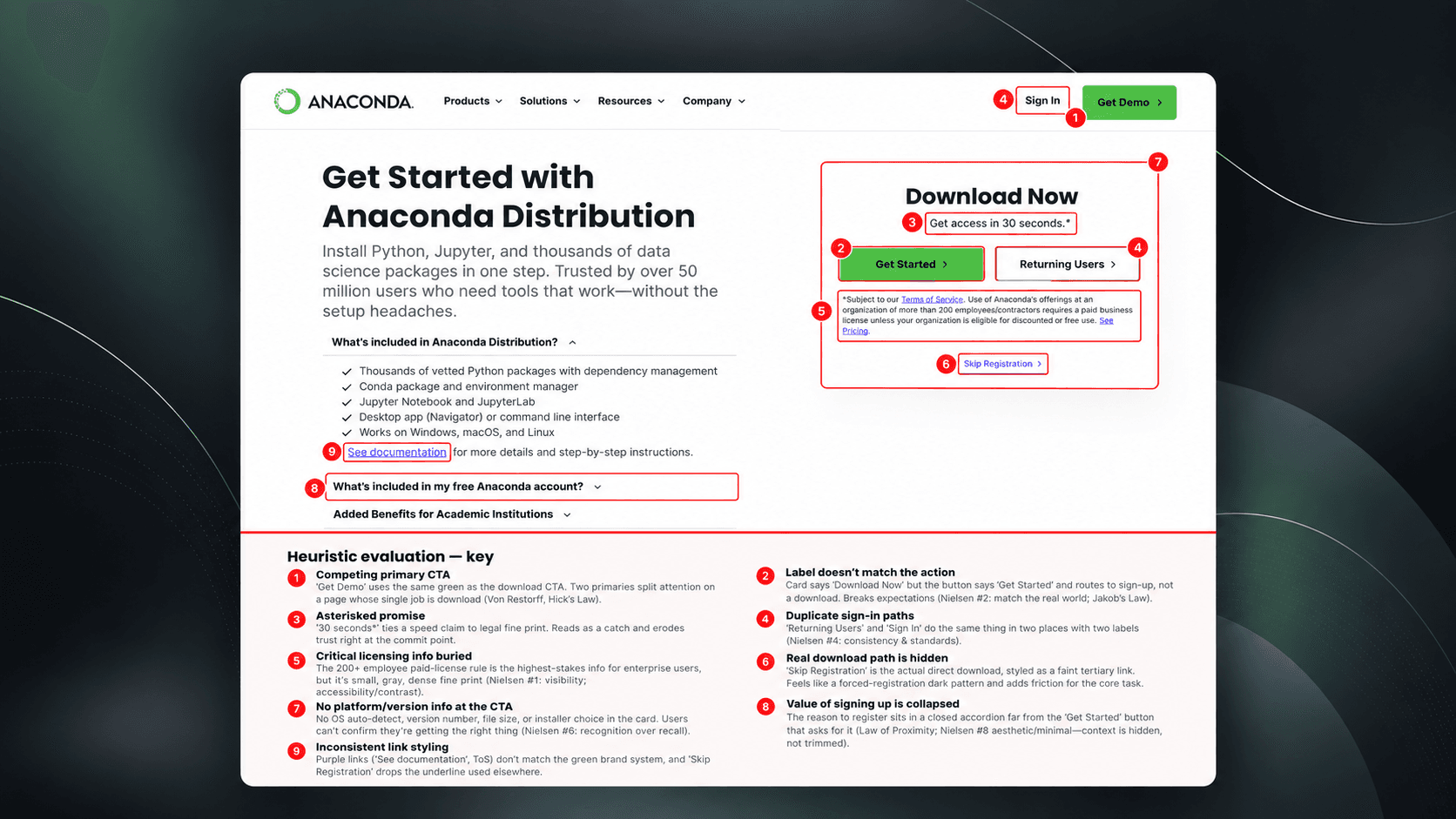
heuristic evaluation
making the friction visible
I evaluated the page’s hierarchy, language, and actions to give stakeholders concrete usability issues to address.

User Testing
showing how users experienced the barrier
I observed users navigating the flow, grounding stakeholder discussions in where they hesitated and struggled to download.

data analysis
More e-mails, questionable value
Download friction and invalid signups challenged whether mandatory registration was delivering the value marketing expected.

Competitive Analysis
Download first, invite signup later
Docker and Postman offered a useful reference: provide download access first, then connect signup to additional product benefits.
rethinking the flow
Making room for signup without blocking download
I compared the original and registration-led journeys, then proposed a sequence that put downloading first and gave Cloud signup its own moment afterward.

Original user flow
easy access, but no e-mail capture
Users could download directly, but marketing had no opportunity to collect emails or build an ongoing relationship.

marketing flow • Skip option added
More friction, fewer downloads
Registration interrupted the download journey. Even with a skip option, downloads remained low and some users supplied fake emails.

my proposal
download first, connect next
I moved the optional Cloud invitation to the thank-you page, preserving email acquisition without putting registration in the download path.
Deliver value first. Help users get the product they came for.
Preserve choice. Let users decide whether to create an account.
Build trust. Restore the straightforward access users expected.
Make signup meaningful. Explain what Cloud offers before asking users to join.
A/B TESTING
Could putting download first work better for both teams?
The research pointed to registration as a barrier. The next step was to compare two approaches: keeping signup first with an option to skip, or helping users download before inviting them to register.

VERSION A: MARKETING'S APPROACH
give users a way to skip
Keep email capture at the start of the journey, while letting users bypass registration to reach the download.

option b: move registration in user flow
give users their product first
Remove the registration decision from the download path, then use the thank-you page to show Cloud’s value and invite users to sign up.
final design
a clearer path to download is a better reason to sign up
This design addressed the friction at its source: users could download without navigating registration, compare product options, and discover Cloud’s benefits before deciding whether to create an account.
key feature changes

Sign up popover: added this popover to the user flow; while users wait for their download to complete, they can have the opportunity to sign up for cloud.

Ease of signing up: users are able to quickly sign up without having to go through onboarding process; that can come later.

Thank you page sign up: if users choose to skip registration, tey can see this as an option again once their download is complete.
Why this design worked better
deliver what users came for
Make downloading straightforward, so users can get started without a registration barrier.
a lightweight foundation
Keep signup optional and core functionality accessible, giving users control over when to create an account.
Make the benefits visible
Showcase Cloud’s additional features on the thank-you page and within the product, giving users a clear reason to sign up.
reflections
Balancing business goals starts with understanding people
This project taught me to look beyond signup counts, listen to competing team priorities, and give users the freedom to choose.
1
Look beyond the metric
I learned that more signups don’t always mean more value. Seeing users submit fake emails taught me to question whether our metrics reflected meaningful engagement.
2
Find common ground
I learned that mediating between teams starts with understanding what each is trying to achieve. Listening to both sides helped me find a compromise that preserved email capture without blocking downloads.
3
earn trust through choce
I learned that asking users to commit too early can undermine trust. Making the product accessible first gave us a better opportunity to explain the benefits and let users decide.