admin dashboard
overview
Anaconda's policy engine generated compliance data with nowhere for admins to see it. I designed Anaconda Cloud's first operational dashboard from the ground up — and the drill-down flow beyond it — turning manual, environment-by-environment checks into a single, at-a-glance view of compliance posture, risk, and remediation, with a clear path into exactly which packages are non-compliant, why, and how to fix them.
Role
Lead UX Designer
product
Cloud
collaborators
Product manager, engineer manager, 2 senior engineers, and 1 user research
timeline
Q2-Q3
constraints
Engineer capacity, time limitations, engineers not following Figma designs
the problem
Admins are frustrated by the lack of a centralized way to see compliance across their organization, forcing manual, environment-by-environment checks that turn remediation into guesswork and leave even security-mature teams blind to risk.
Business Need
Protect renewal revenue by giving SEC admins visual proof — at a glance — that the policy engine they were paying for was actually working.
User Need
A single dashboard to monitor compliance posture, violations, and SLA risk across the organization.
potential constraint
Stakeholder prototype
After our project manager showed us a prototype he mocked up for the dashboard, I wanted to take into consideration not only what he envisioned for the product, but also - and mainly - what the users and the business need.
The PMs prototype had some good ideas, but it was missing stategy and consideration of where the user is coming from - and where they need to go.

what is it that fuels their user journey?
Where are the admins before the dashboard?
where do admins go after the dashboard?
research & synthesis
01-discovery & definition of user needs
After conducting a heuristic evaluation, competitive analysis, and admin interviews, I learned find that admins wanted fast access to three things:
heuristic evaluation

competitive analysis

user interviews

1
compliance posture
Admins want their compliance posture presented at a glance, not something they have to dig for.
2
remediation enablement
Knowing something is wrong isn't enough on its own; admins need a clear path to actually enable their team to fix it.
3
drill down into problems
Admins want a high-level summary by default, with the option to drill into specifics only when they choose to.
ideation
02 - Developing concepts
After defining the user problem and considering both user and business needs, I then researched best practices for creating dashboards. I landed on two main concepts to fuel the design process:
map out users’ mental model
Upstream intent: define operational questions and target user workflows before choosing charts or pulling data
reduce cognitive load, organize content
Progressive disclosure: show high-level critical metrics upfront, allowing users to drill down into deeper detail only when needed


FEATURE PRIORITIZATION
WHAT FEATURES DO ADMINS ACTUALLY NEED?
Based on user interviews and competitive analysis, I complied a list of features that our admins would need to quickly scan and identify non-compliant environments - and fix them. I conducted a RICE feature evaluation to determine these features.
Environments table
Compliance overview
Alerts inbox
Environment detail drawer
Dev notification route
DASHBOARD CONCEPTS
How to reduce cognitive load
After understanding the ideal user flow to govern and remediate environments, I looked into best practice dashboard design concepts, as well as anlayzed our competitors dashboards), to figure out which pattern would best fit our users' needs.
Concept 1
few’s dashboard principle

Everything fits on one screen for a true glance check, cards are grouped by decision (coverage, sync, violations, connections) rather than data source, and the alerts panel sorts by severity so problems surface before healthy states
concept 2
Shneiderman’s mantra

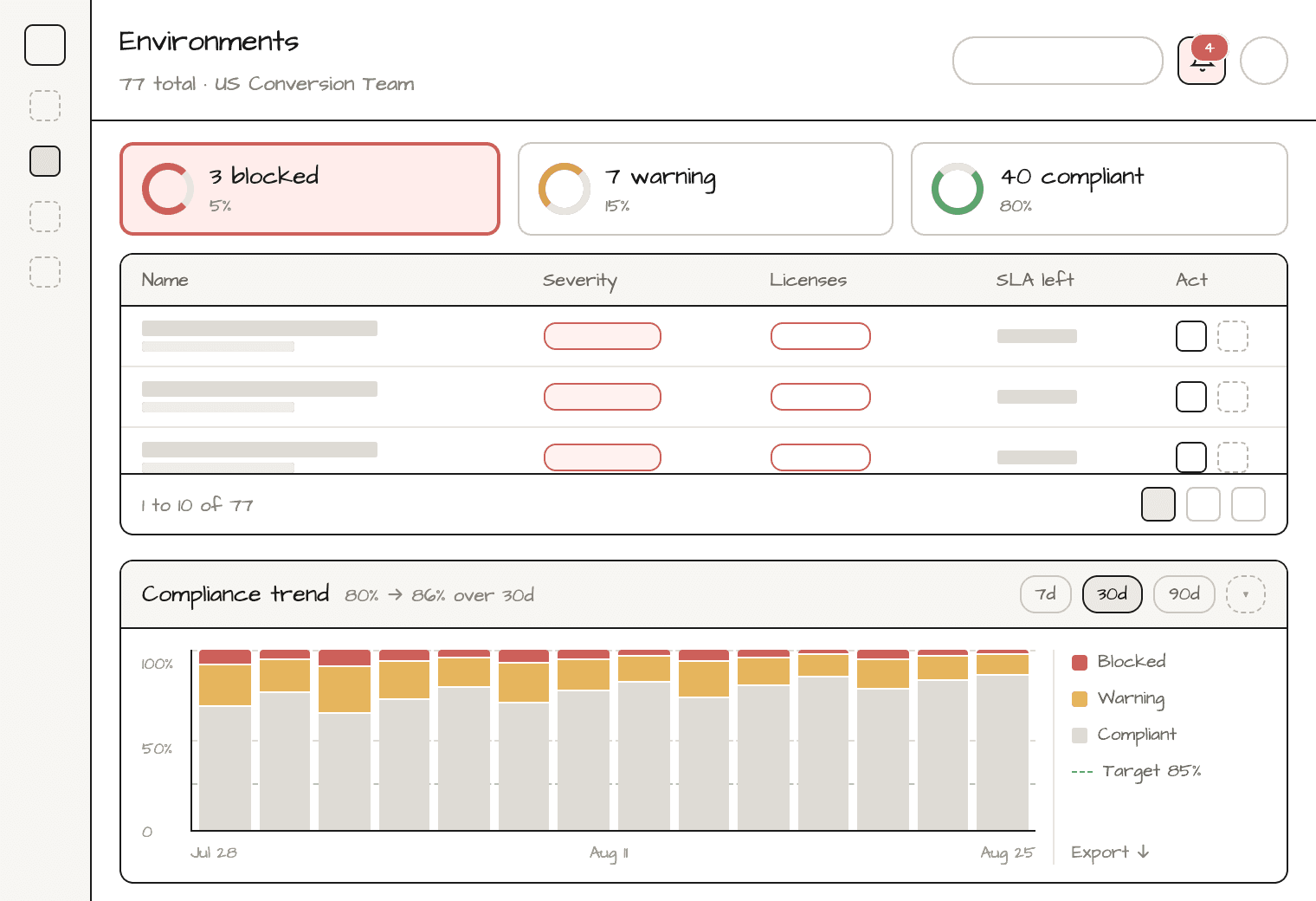
Summary chips give the overview, search/filters let admins narrow 84 environments to what matters, and rows stay collapsed until clicked to reveal drift cause, policies, and actions. This one’s built for admins who act, not just monitor.
OPTIONS
applying dashboard principles to our users’ needs
option 1
few’s dashboard principle applied
Dashboard overview

Drawer for environment detail and action

Alerts

Compliance trend
option 2
Shneiderman’s mantra
Dashboard overview

2.Drawer for environment detail and action
Alerts

Compliance trend

user testing
03 - testing our concept
For user testing, we did A/B testing on two variations of the dashboard. We then conducted moderated usability using the favored design from the A/B test.
Using the Claude prototype I created, we gathered four different admins across various regions to test our two dashboards concepts. Our key insights include:
We need to include a way for admins to alert or share remediation fixes for devs.
Table in concept 1 better at reducing cognitive load.
The "warning" label should be replaced with "non-compliant" to match industry standards
Wanted a more interactrive, clear visual for the compliance trend.
Wanted to know what came before and after this dashboard experience to understand the whole user experience.

final design
04 - creating the ideal user experience
When users seemed a little lost due to the flow not being fully considered, we went back in our sketches and realized that the whole experience - from create an environment policy to environment dashboard to remediation - should follow the same threads: which environments are non-compliant/in violation of policy, and how do we fix them?
Measure of success
Up to 50% faster remediation
during beta testing with a couple of companies, admins using the dashboard saw a remediation time drop from roughly 4 minutes down to 2 minutes for some users.
support ticket decrease
during the beta testing phase, we saw a near complete decrease in the amount of support tickets regarding non-compliant environments (understanding this is beta and not full-scale adoption yet).
Design debt resolved: 5 for 5
Every open UX question flagged during design(CVE severity representation, alert type naming, icon-color consistency, alerts-vs-trend layout weighting, and the table/chart toggle debate) was resolved before handoff.
reflections
05 - takeaways to become a senior designer
This was my first major project as a lead product designer. The lessons I learned from this helped me hone my design process and leadership skills so I could become the senior designer I needed to be.
1
Build QA into the calendar, don't wait for handoff.
One engineer regularly diverged from the Figma spec, and asking him to flag finished work wasn't reliable. I started a standing weekly sandbox check instead of trusting handoff as a final checkpoint.
2
Own the project's direction, not just its design.
Having a PM, EM, and engineers doesn't guarantee anyone keeps the project moving; I learned that's the designer's job too, and started running my own weekly check-ins to hold the line.